

There’s telling people about the climate crisis – and then there’s showing them the climate crisis. And today, it’s time to share a striking visual: Warming Stripes.
From Climate Central:
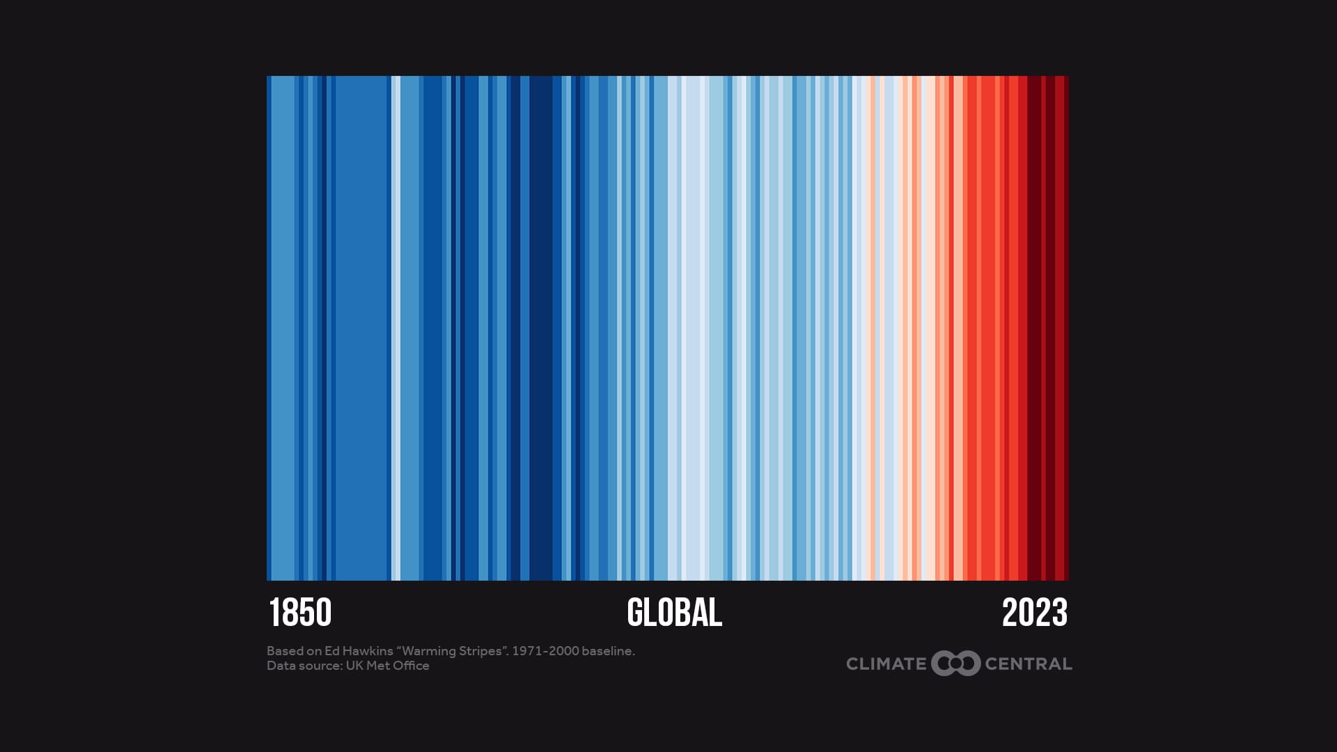
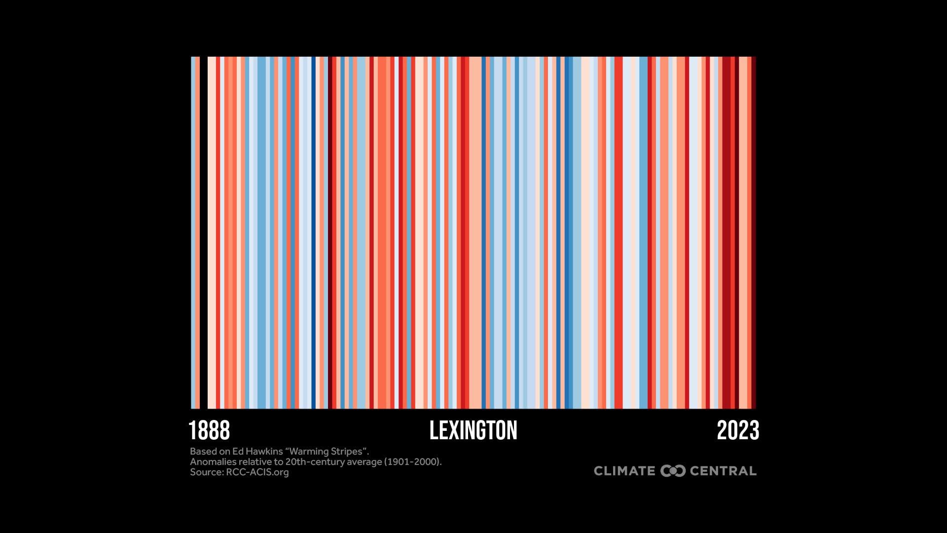
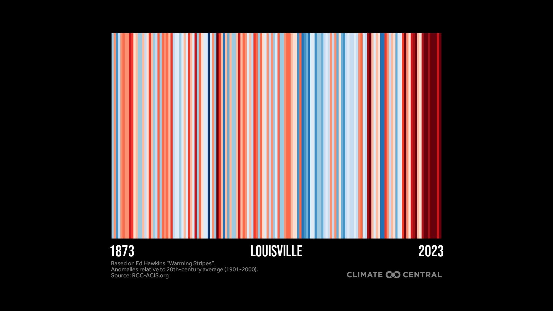
Created by Professor Ed Hawkins at the University of Reading, the global warming stripes are a simple visual representation of the long-term rise in global temperatures due to human-caused climate change.
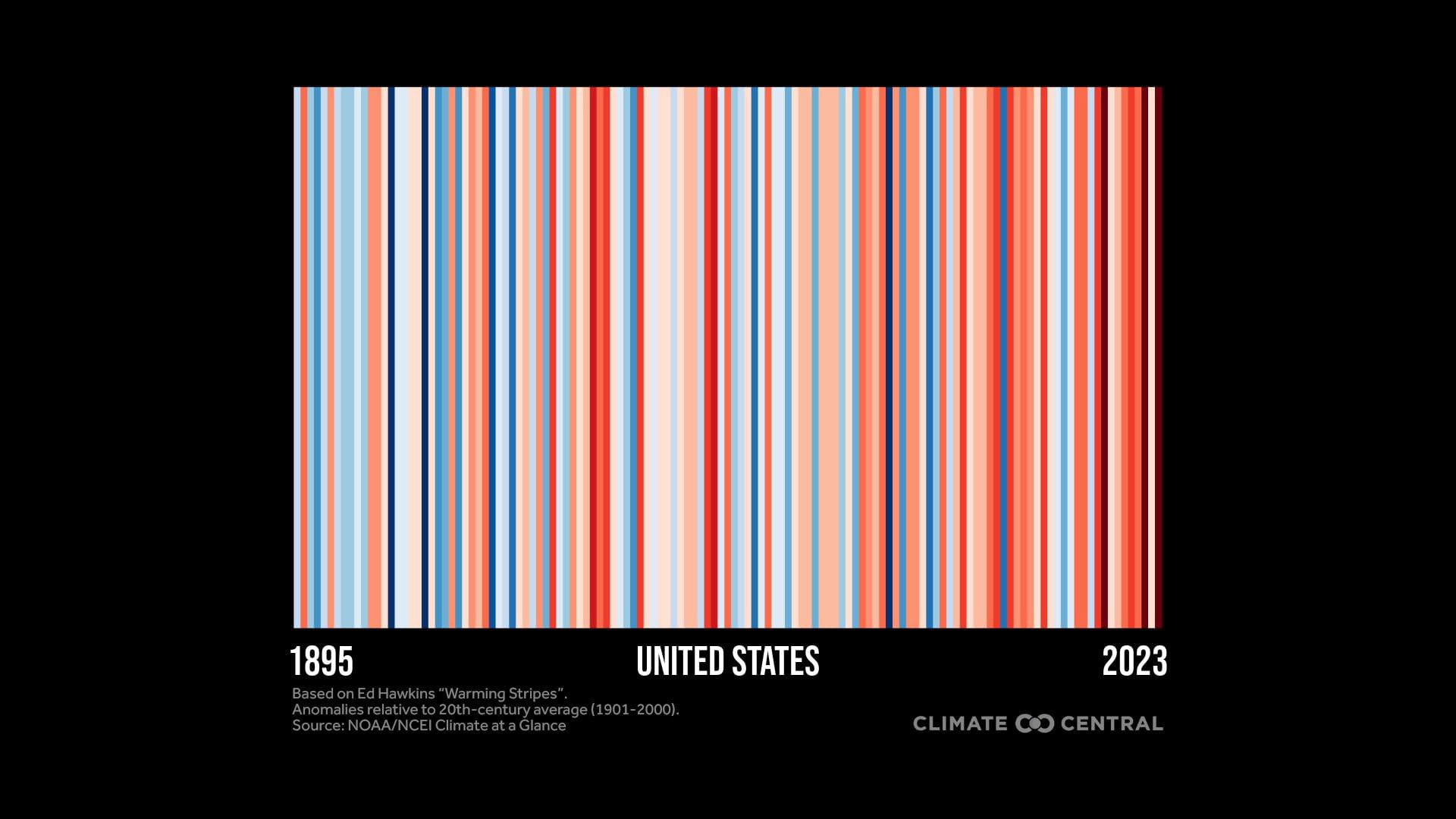
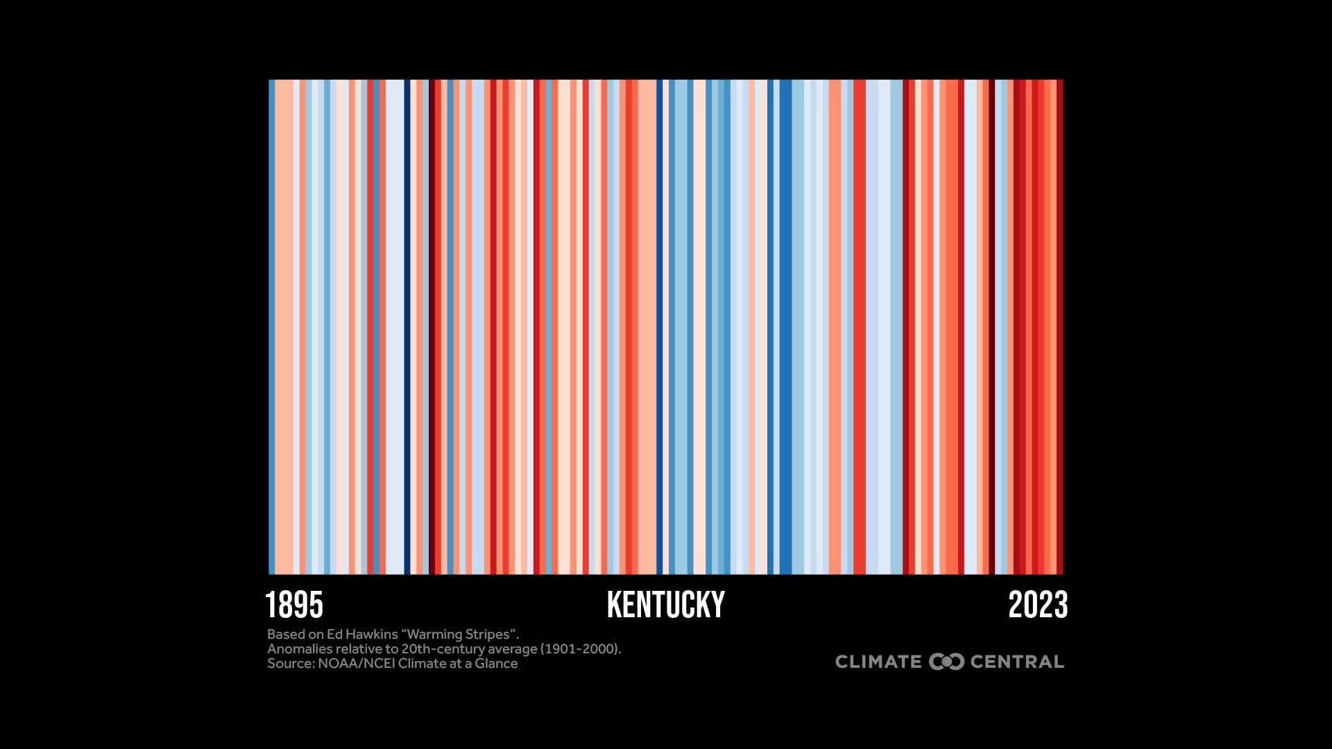
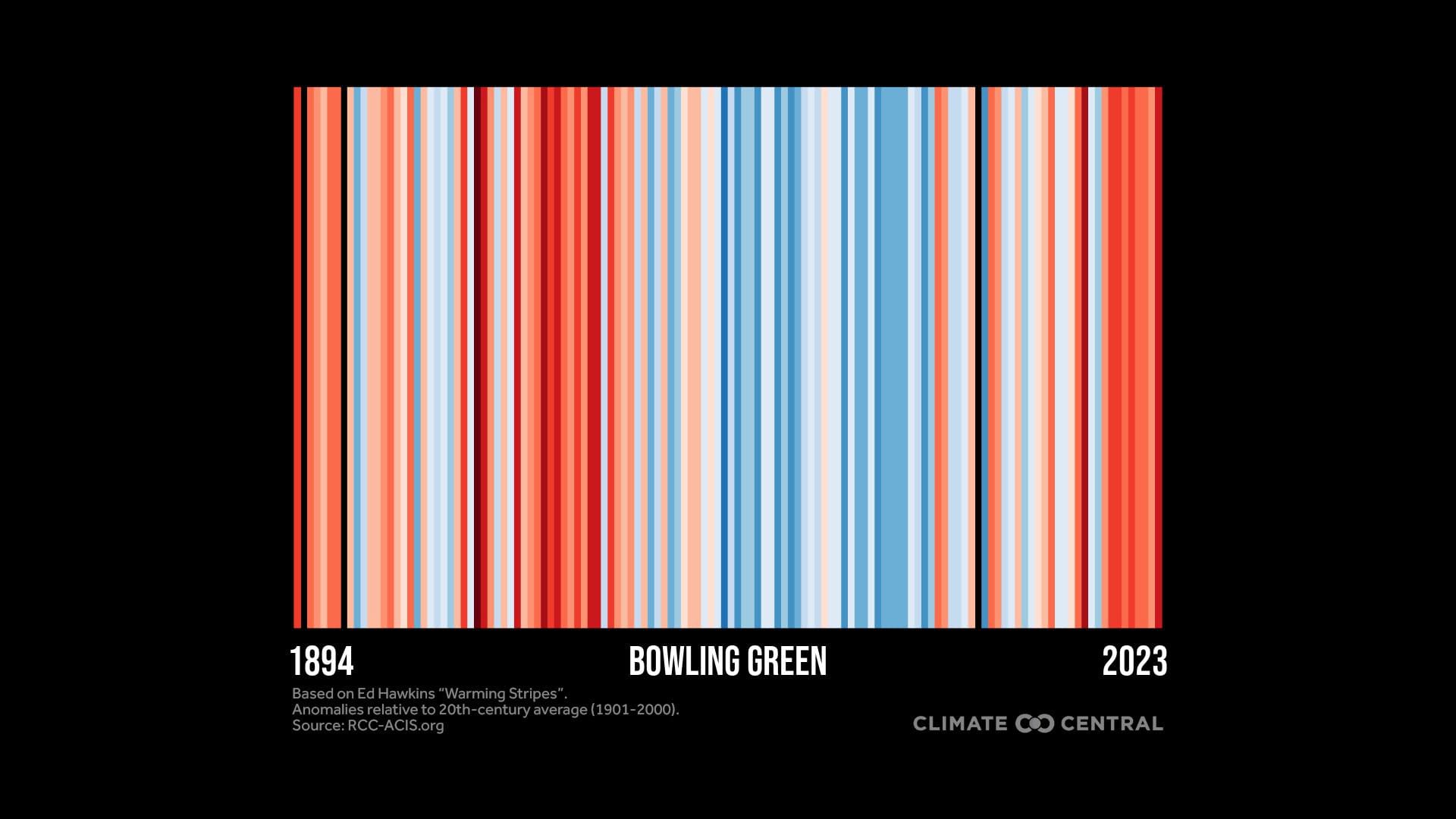
Each stripe represents the global temperature averaged over one year, from 1850 to 2023. Red stripes are years that were hotter than the 1971-2000 average; blue stripes are years that were cooler.
Some of the warming stripes seem to be a mix of warmer and cooler, while others are an obvious hair-on-fire trend. But they all show the same thing: our planet, our country, and our state and cities are getting inexorably hotter. And if we don’t take more and more effective action, the stripes will keep getting redder, and our future will continue to look worse.
Here, then, are the graphics for global, U.S., Kentucky, and three Kentucky cities. We ask that, on this #ShowYourStripes Day, that you share this article widely. Perhaps showing the crisis will make an impact.
|
Global Warming Stripes
U.S. Warming Stripes
Kentucky Warming Stripes
Warming Stripes for Bowling Green, Lexington, and Louisville
--30--


